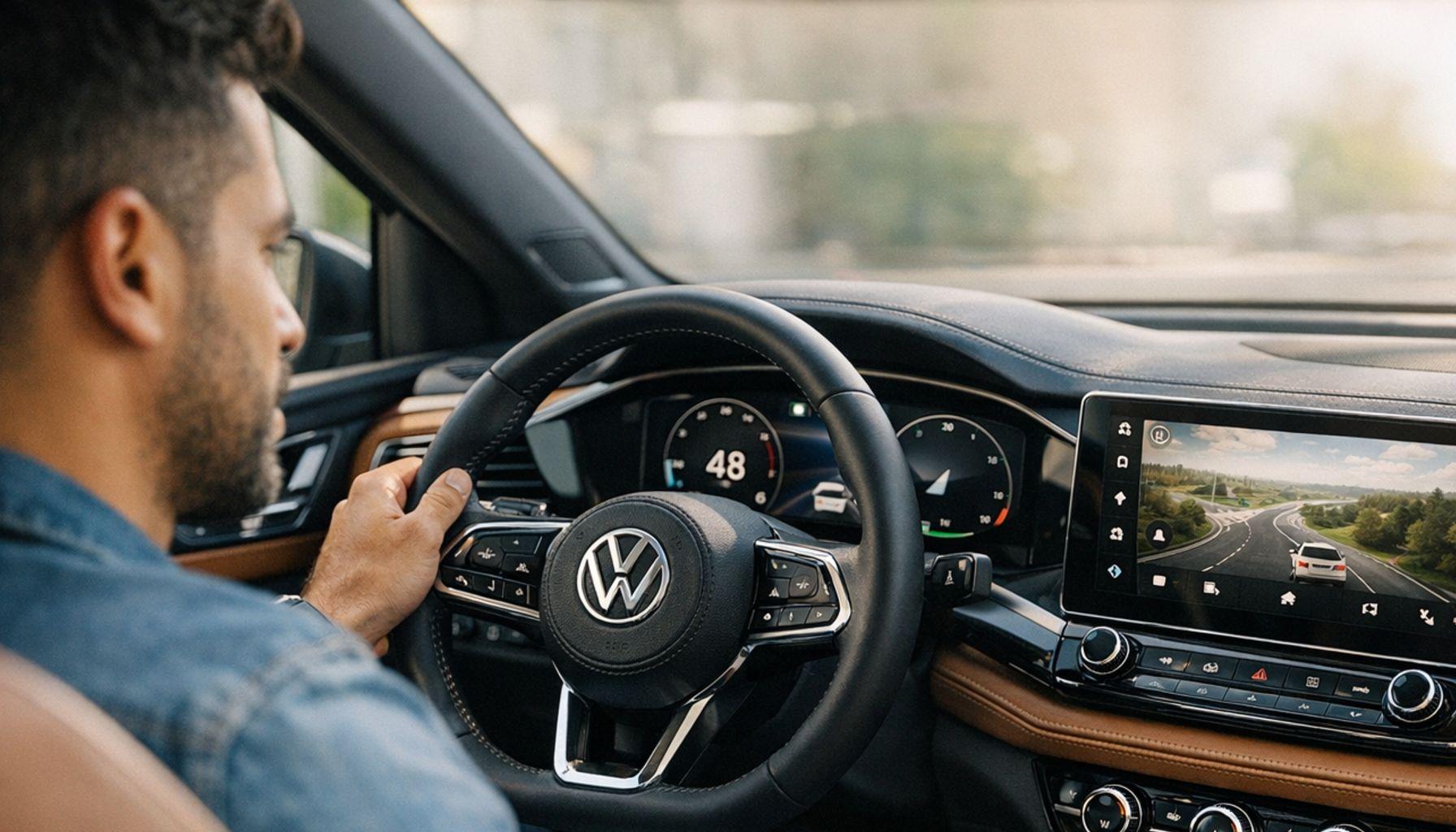
Volkswagen just revealed what could be called the secret ingredient behind its design decisions.
Earlier this year, the German automaker introduced a new generation cockpit, and the ID. Polo was chosen as the first model to debut this innovation.
Along with this reveal, VW also unveiled its new design language called Pure Positive, which already sets the tone for what to expect in upcoming electric lineup launches.
But what really grabs your attention isn’t just the look.
It’s the way user experience was placed at the heart of every interface decision, from choosing on-screen elements to the details that blend a modern aesthetic with retro nods.
To understand how all of this was conceived, Mathias Kuhn, head of UX/UI design at Volkswagen, opened up about the values guiding the company’s approach. And the starting point is simpler than you might think 👇
The user always comes first
One quote from Mathias Kuhn pretty much sums up the brand’s entire philosophy. According to him, UX design always starts with people. That might sound like one of those slick corporate presentation lines, but when you look at what Volkswagen did with the ID. Polo, you can tell there’s real substance behind the talk.
Kuhn emphasizes that the company puts the user at the center of everything and carefully listens to their feedback throughout the entire development process. In other words, it’s not technology dictating design — it’s the real needs of the person behind the wheel calling the shots. That shift in priority is exactly what VW points to as its edge in the competitive world of automotive user experience.
Worth noting that this new cockpit generation didn’t just appear out of thin air. It’s the result of years of active listening, testing with real drivers, and fine-tuning based on how people actually use a car’s dashboard day to day. It’s not exactly reinventing the wheel, as the industry itself acknowledges. The real challenge is doing it in a way that feels unique and genuinely appealing enough to win over a new wave of customers. 🚗
Clarity above everything else
One of the most important pillars of this philosophy is clarity, and it’s no accident that it takes center stage. The idea is that every interface decision inside the ID. Polo cockpit has to pass a basic filter: can the driver understand it quickly without having to think too hard? That reasoning sounds simple, but it goes against a lot of what the automotive industry has been doing in recent years, especially with the craze for giant screens packed with options that confuse more than they help.
Volkswagen decided to take a step back and rethink what really needs to be visible while you’re driving. This pursuit of clarity also shows up in how elements are visually organized on the dashboard. Instead of stacking information and creating visual overload, the new cockpit prioritizes a clean hierarchy where every piece of data has its place and its weight.
The result is a screen that feels like it can breathe, with well-distributed spacing and nearly instant readability. For anyone who’s ever had to take their eyes off the road for a few too many seconds trying to adjust something on a modern car’s infotainment system, this shift in approach makes a huge difference in practice.
And here’s an important point about Volkswagen’s UX design process: clarity doesn’t mean visual poverty. The new cockpit is sophisticated, has aesthetic depth, and makes good use of available graphic resources — but without letting any of that compromise functionality. Kuhn’s team worked to ensure that beauty and usability go hand in hand, without one having to sacrifice the other. That’s actually one of the hallmarks of well-executed contemporary design, and VW seems to have grasped this in a pretty mature way.
Familiarity with a retro touch
Another aspect that really stands out in the new cockpit is the blend of modern software and retro references. And this isn’t some random style detail — it’s a strategic choice directly tied to user experience. At first glance, it might seem odd that an innovation-focused automaker would want its products to feel familiar. But the logic behind it is pretty solid.
When someone gets into a new car and faces an interface that looks completely alien, the time it takes to adapt goes up — and that creates friction, frustration, and even insecurity. Familiarity shortens that learning curve and helps the driver feel comfortable faster.
In the case of the ID. Polo, this strategy shows up in some really interesting ways. Volkswagen chose to mix contemporary elements with visual references that call back to previous generations of the brand’s dashboards. It’s not nostalgia for nostalgia’s sake — it’s a deliberate choice to build a bridge between past and future, making anyone who already knows VW cars feel right at home even when facing a fully digital interface.
This is one of the most sophisticated nuances of the project, because it requires the design team to deeply understand both the brand’s history and the behavior of its users. Volkswagen’s UX design team mapped out which interaction patterns drivers are already used to — both from other cars and from everyday devices like smartphones and tablets — and used those patterns as a foundation to build something new that still feels intuitive from the very first moment.
Real control in the hands of the driver
Rounding out the set of values behind the brand’s approach, we have control — and this one might be the most directly connected to driver safety and confidence. The core idea here is straightforward: the system exists to serve the user, not the other way around.
That means the ID. Polo cockpit was designed so the driver always feels in command — that information is available when needed, that adjustments can be made quickly and without hassle, and that the car responds in a predictable and transparent way to every action. This sense of control is essential for reducing stress behind the wheel, especially during heavy traffic or on unfamiliar routes.
In practice, this translates into very specific design choices within the interface. The most-used controls are always accessible without the driver having to dive through layers of menus. Notifications were calibrated to avoid unnecessarily interrupting the attention of someone on the road. And the system as a whole was built to give clear feedback on every action taken, whether it’s a screen tap, a temperature adjustment, or a driving mode change. The user experience here isn’t about aesthetic enchantment — it’s about efficiency and confidence in every millisecond of interaction. 🎯


What this means for the future of VW’s electric lineup
The reveal of Volkswagen’s UX design philosophy isn’t just a statement of intent for the ID. Polo. It works as a manifesto for the brand’s entire lineup going forward. The Pure Positive language that accompanies the new cockpit already signals that clarity, familiarity, and listening to the user will become defining traits of the interface in upcoming VW models.
This creates a consistency in user experience that’s incredibly valuable for a brand looking to build loyalty in a market that’s increasingly competitive and full of new players. Another point worth highlighting is how Volkswagen’s approach contrasts with the path some competitors have chosen.
While part of the industry still bets on interfaces increasingly loaded with features and screens that look like giant tablets glued to the dashboard, VW is heading in the opposite direction: less noise, more clarity, more control for the driver. This bet is consistent with what usability research has been showing for years — that users prefer efficient simplicity over impressive complexity, especially in contexts where divided attention can pose a real risk.
At the end of the day, what the ID. Polo cockpit story reveals is that Volkswagen is taking UX design seriously as a strategic discipline, not just an aesthetic detail. Having a professional like Mathias Kuhn dedicated to articulating clear values and applying them consistently across every interface decision is a sign of maturity that few automakers demonstrate this clearly.
And for anyone following the automotive market and the evolution of interfaces, this is a strong indicator that VW isn’t just building new cars. It’s building a new way of connecting with whoever is behind the wheel — always starting with people. ⚡